
[Originally posted on March 11, 2016 at 9:12PM.]
Here, for your entertainment, are two pages with the same textbook content. One page was designed by me; the other was made by our contracted designer. I'm not going to say that I'm the Picasso of design, but I managed to use the Shutterstock graphic to better effect (instead of postage-stamping it into near-nothingness), and I made the text larger: even if you shrank the page so that it's closer to the dimensions of the designer's page, my text would still be larger. So which is better? I display; you decide.
The designer first:

Now me:

I think you can do a lot if you just stretch your mind a bit. For me, an image has to pop, i.e., it has to pop out of the page in a dynamic way—perhaps through the use of bold colors or through some other technique that lends dimensionality to the image—like shadows or clever optical illusions. Kids are generally going to loathe their textbooks, but better design can make using the books a more tolerable experience.
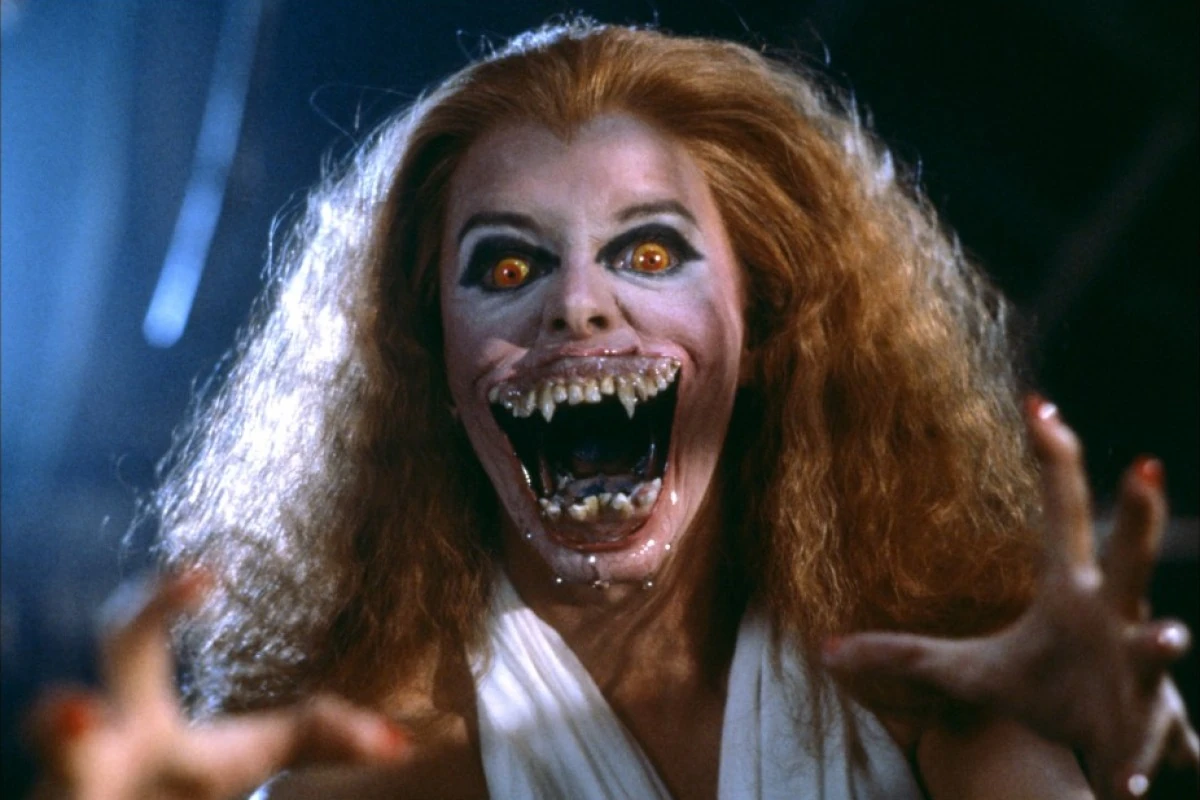
If I were to be hyper-critical about either of the above-displayed pages, I might pick on the fact that the vampire has only a tenuous link at best to the concepts being taught on this page. The vamp is bursting through some sort of paper barrier as opposed to standing in front of a mirror and having no reflection. No graphic on the page is showing any sort of reflexivity at all. In that sense, this design might count as a failure. The picture serves as little more than a distraction; it's a visual punctuation mark and little else.
A better page would do something with mirrors, or there'd be a humorous pic of someone hitting him- or herself in the face with a tennis racket or a baseball bat or something. In my defense, though, I liked the vampire lady; she reminded me of the scary chick who vamps out near the end of "Fright Night." It seemed a shame not to use this Shutterstock image, and besides, illustrators do the image-as-punctuation thing all the time.
Not that this matters: I did the above page as an exercise in counterfactuals: the "would've"s and "could've"s. We're stuck with our designer, and that's that.
_


I am impressed with your attention to detail. I especially like the way Song's box is tilted just enough for the character to rest his right elbow and left hand on it. The vampire is good too, but obvious. I mean, that's what you most wanted to fix while Song's box was not your main concern.
ReplyDeleteIn things that I design I would have gotten the equivalent of the vampire right but ignored the placement of the character. Maybe I am like your publisher, or could work up to her level some day.
Just a note: technically, we're the publisher and she's the designer that we retained. I don't think she's an evil lady or anything, but I do think she's creatively lazy and unambitious, and I don't think we're getting what we're paying for when we rely on her services.
ReplyDeleteThanks for the kind words. My main problem, though, is that I still consider myself a Photoshop newbie, so the above page took a few hours, and I went through a long line of decisions at every step of the process. A lot of the work I do at the office actually comes down to that: just sitting in front of the monitor and staring while mentally chanting, "What next? What next? What next?"
I'd like to learn to use Adobe Illustrator, which is much better suited for the kind of design work this entails. It's just a matter of persuading my boss to purchase a copy of Illustrator for office use.
I design pages and posters in PPT or more accurately, Google Slides, and really need to up my image-manipulation game. I have paint.net on my computer but have used it only twice.
ReplyDeleteYour mock-up blows away your designer's due to its ease on the eyes (well, except for SONG'S GRAMMAR TIP which seems a bit too small and cock-eyed). And if I were in the market for this type of textbook, your designer's would not even be close to making the cut when it comes to readability and understanding as nothing in it stands out from the crowded, uncreative ton of equally dull and monotonous textbooks filling row upon row of English textbook bookstores across South Korea.
ReplyDeleteMaybe a trip to one of these bookstores might help open the eyes of your boss to see not only the the extreme abundance of textbooks in the marketplace, but what those are that are actually selling look like.
Does your company use market research/focus groups at all? There's a reason Apple does so well with the female half of the population even with their higher prices as presentation/design is a major part in the art of selling. Appearance actually matters, and half of all students are female.
Anyway, you might want to hold on to your mock-up as it looks pretty professional and might be useful as a selling point to a future employer.
John,
ReplyDeleteI'll agree the text in the grammar tip is small, but that's partly because you're looking at a reduced version of the original image. It looks much clearer in printed form. As for its being cockeyed: aligning it straight and horizontal would have presented its own technical and aesthetic problems. Personally, I prefer it off-kilter as a way up breaking up the visual drudgery of relentlessly rigid text.
Thanks, though, for the kind comments.
John,
ReplyDeleteOh, yeah: as for market research, no, we don't do nearly enough. We should do more. This was a complaint of my previous coworker, who felt that we often made products without really checking out our market first.